These books I chose for their outward beauty
Ok, this article is a bit special.
I realized, by writing on The intelligence of happiness (link to the article here), that there was an increasing number of books that I chose for their cover and I wondered if I should be ashamed of it (essential question at home, you will be able to notice it – I reject the fault over 5 years of study of Letters and an annoying contempt for the so-called popular literature distilled by the teachers whom I adored).
« Don’t judge a book by its cover » says the proverb.
But it is clear that this has become completely false in terms of publishing (with a few exceptions, of course): there are real codes (increasingly used by publishing houses) so that the potential readers find their way around and know roughly what to expect when they buy a particular book.
NB: When we talk about code, we talk about colors, graphics, format … But also title and synopsis / pitch / summary (everyone can choose the term they prefer).
So I decided to make a very small inventory of these books that I read (and / or bought) because I liked their cover, to see a little more clearly and above all, try to learn a lesson: When I choose a book because I find its cover sublime or because the pitch is catchy, do I like the book behind? Do the codes used work? Are these codes still being used wisely?
- Silence, by Erling Kagge
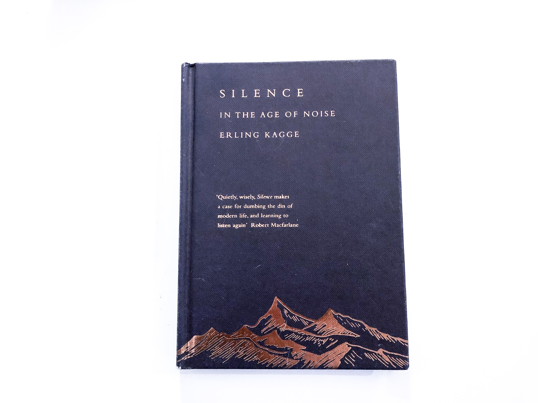
I wrote an entire article on Silence, this was my first real blog post (link here). I had bought this book in England, in a very pretty independent bookstore of which I unfortunately did not keep photos.
What the cover of this book told me, it was that I was dealing with a meditative book, which was going to speak of nature, of silence (I break open doors) and whose writing would probably be sober (it was clear that we were not in the comic register). The promise was kept. I was obviously attracted by all this, but also by the beauty of the object: we do not see it on the photo but the cover is rigid with drawings and golden letters in relief, the book is bound, a real object.
But all that was not enough really : It was the back cover that convinced me, in particular the description of the author’s background.
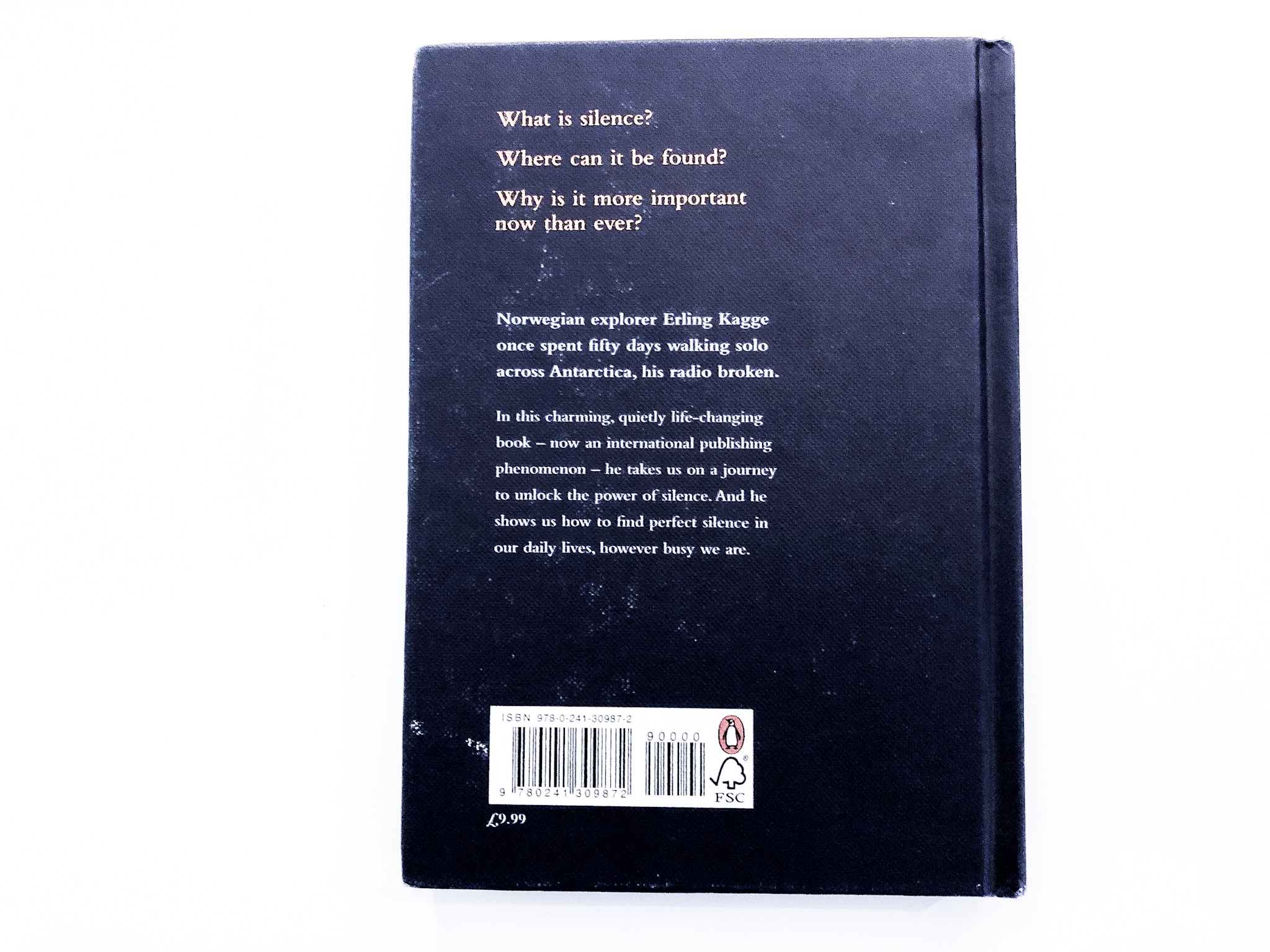
« What is silence?
Where can we find it?
Why is it more important than ever today?
Norwegian explorer Erling Kagge traveled solo across Antarctica for 50 days with his radio broken.
In this charming and life-changing book (which has become an international phenomenon in the publishing world) he takes us on a journey whose purpose is to bring to light the power of silence. And it shows us how to find perfect silence in our daily lives, however busy we may be. »
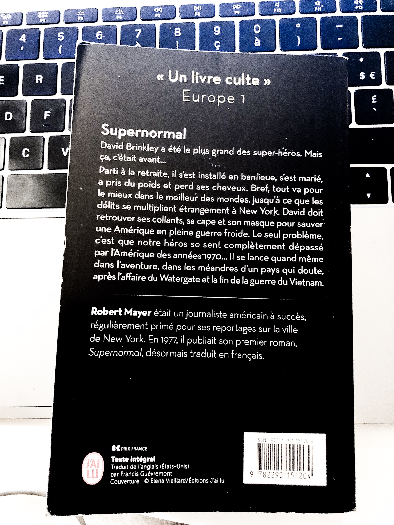
2. Supernormal, by Robert Mayer
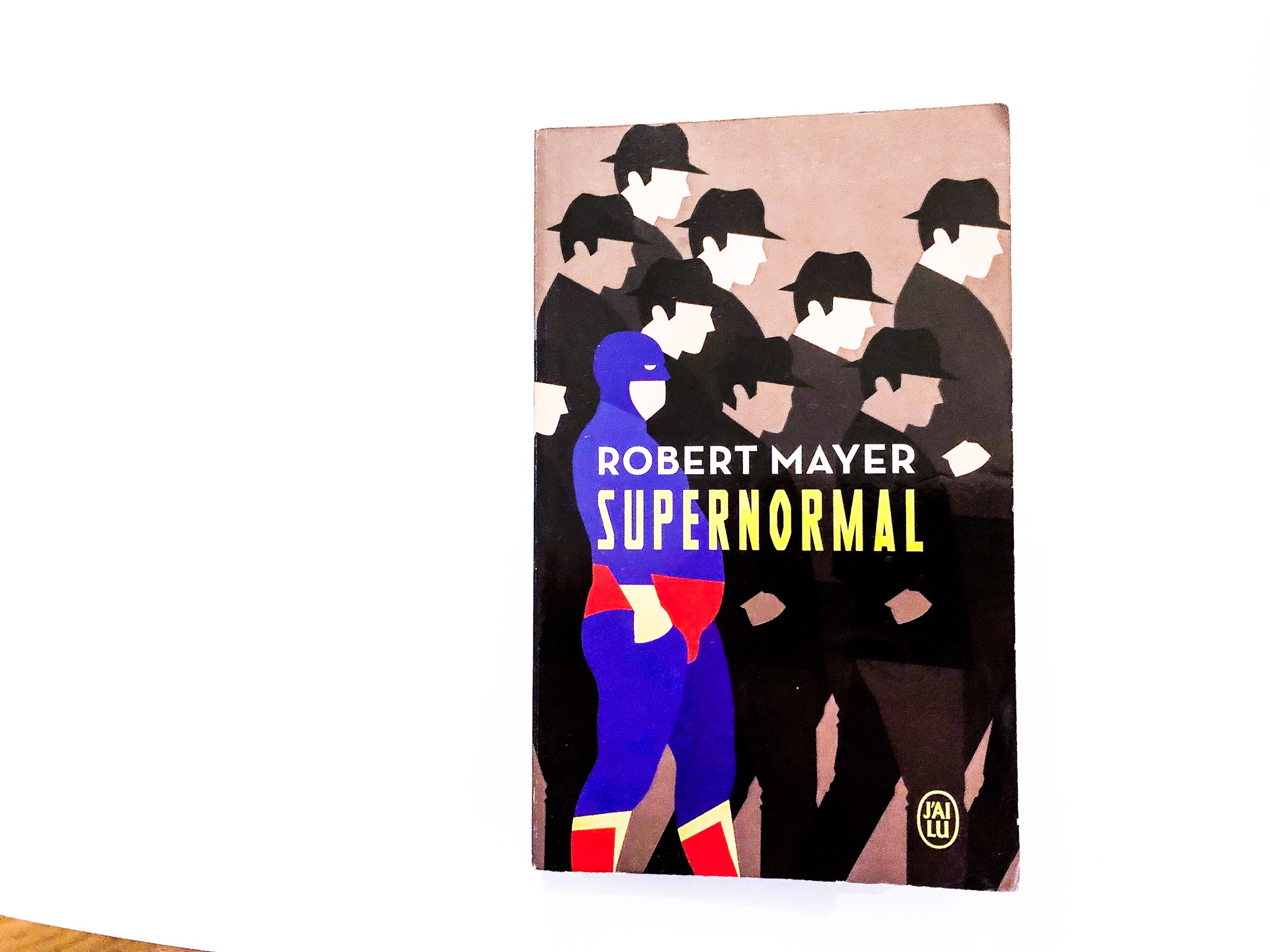
I had extracted Supernormal of a stack of paperbacks to donate.
Why him ? Because its cover was different. Different from what I’m used to see and different from what I’m used to read. As for Silence, it was the back cover that convinced me.
I was won over by the hero’s trajectory that the pitch promised, a situation that very seriously brings to mind the Incredibles (the animated film). The promise was a bit like Philip Roth Marvel version, all contextualized in a very particular (and tempting) period in the history of the United States.
In addition, we had this punch argument which already convinced me twice with Fiona Barton (The widow and The cut): the author is / was a journalist. It may seem surprising but I always trust Anglo-Saxon journalists when they immerse themselves in fiction. There is always this I do not know what that the others do not have, this very particular way of intertwining everything, of using History, of sociology, to build a realistic universe credible and enthralling.
Regarding this book (on which I did not write here), my final opinion was more mixed than the idea that I had a priori. I had regretted superfluous lengths and a somewhat bizarre ending … But the promise was kept at 80%.
3. Where’d you go, Bernadette? by Maria Semple
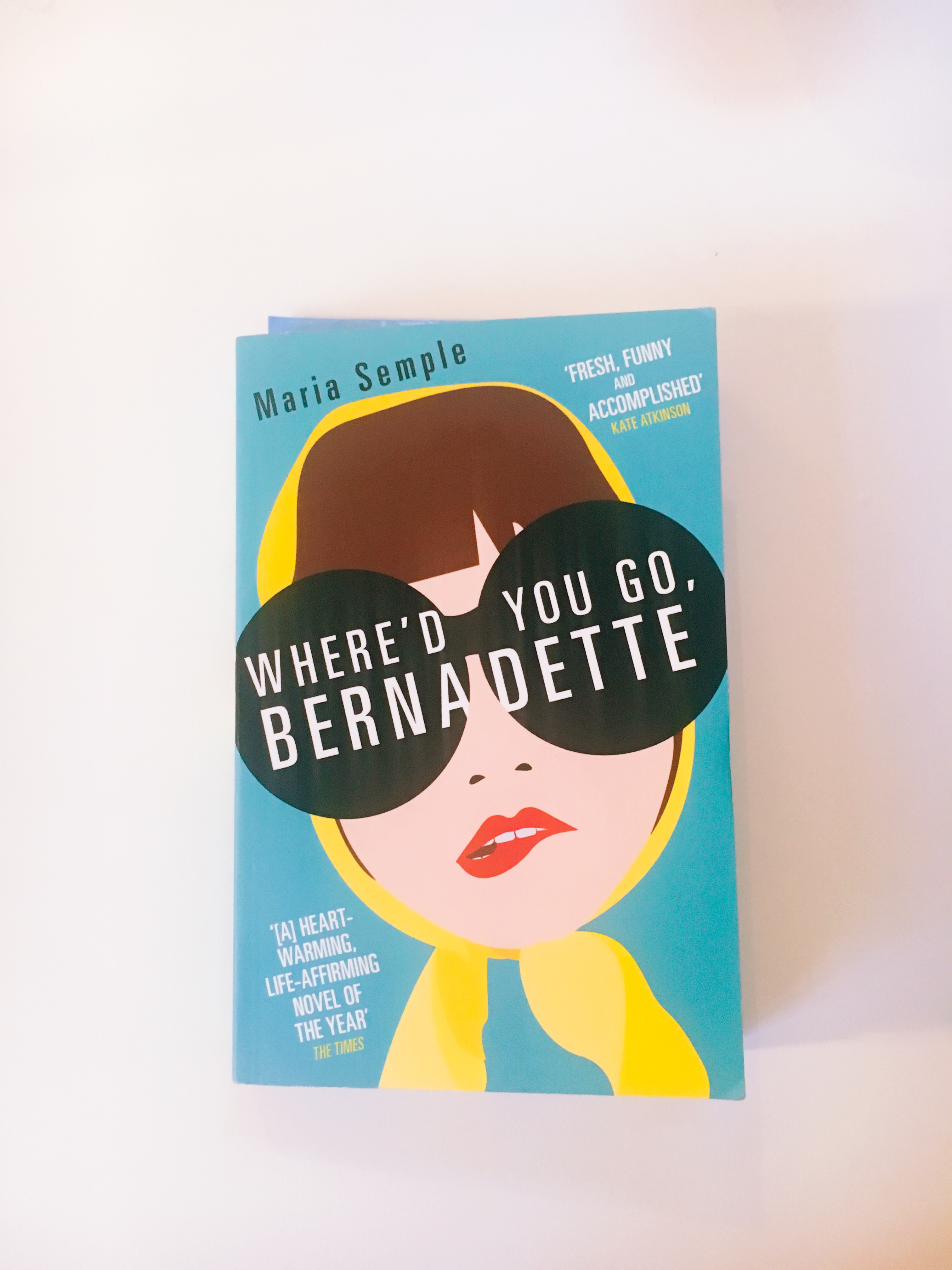
Same as for Silence : book bought in England, but love at first sight for the cover, crazy. I’m not including the back cover, because I don’t even think I read it before I went to checkout. Which never happens to me.
And what’s amazing is that I liked this book as much (maybe even more – which is saying a lot) than its cover.
I hadn’t read anything about it, I had never heard of it, so I didn’t know there was already a French translation (Amazon link here). I say this because I felt the same love for Eleanor Oliphant is doing very well, but then it was Instagram and the cloud of posts about this novel that made me buy it.
The promise of the cover, pop, delusional and enjoyable, was totally kept by the text carried by the adolescent daughter of Bernadette (which explains the side juvenile of the cover).
4. Between two worlds, by Olivier Norek
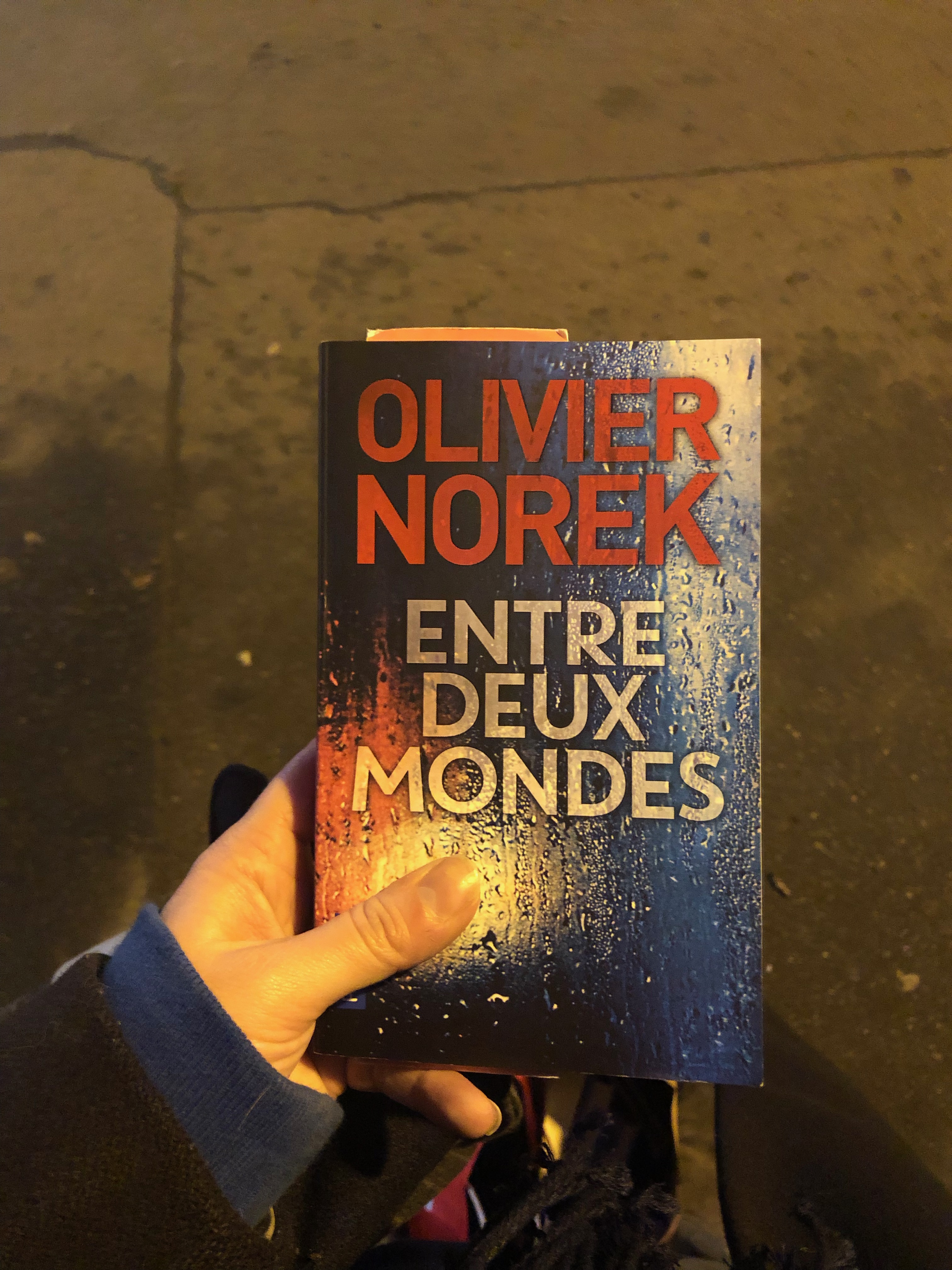
Typically, here is the counterexample to everything I just wrote.
This book, I put it aside despite of its cover. The red letters, this bizarre background of wet glass in blue, white, red hues … Everything foreshadowed (for me) a bad novel leaning towards horror.
I always find that there is something cheap, a little cheesy and not exciting in this graphics.
The back cover, for its part, is of no interest since it does not include a pitch, just a sentence: « Adam discovered in France a place where you can kill without consequences », followed by 3 media opinions . To be honest, I have no idea why I took it out of the pile. And yet the text has nothing to do with all of this and it is even frankly good.
We also learn, when we open the book, that the author has been a police lieutenant in the Investigation and Research section of the SDPJ 93 for 15 years. Why not have included this information on the back cover, mystery.